Copied link to clipboard!
brand guidelines
Welcome to our brand guidelines, a digital tool we’ve created to help make it a little easier for you to maintain our brand.
Here you’ll find the foundational elements that create our brand identity. Consistency is key in keeping our brand presence strong. Consistent and repetitive usage of these elements will create lasting recognition in our noisy world.
concept
We design. And develop. Together. This true integration sparks one-of-a-kind, immersive brand experiences that push past the sea of sameness and dare people to connect.
values
Our brand values are the beliefs that we stand for. They serve as the compass that guides our brand story, actions, behaviors, and decision-making process. Our team lives by these values, are recognized for reflecting them, and when decisions needs to be made we refer to them often.
driven
sincere
committed
fearless
people-centric
mission
We’re an offbeat, no-holds-barred kind of creative studio — giving it all we’ve got, with zero reservations. We design. And develop. Together. This true integration sparks one-of-a-kind, immersive brand experiences that push past the sea of sameness and dare people to connect.
personality
Our brand personality are a set of human characteristics our brand reflects. They are communicated through visuals, tone of voice, and even customer service.
courageous
insightful
candid
offbeat
fun
fierce
passionate
loyal
resolute
tagline
Our tagline acts as a verbal logo. It tells people what we do simply and memorably.
connecting brands with people.
logo
Our logo is the face of our brand identity, and is used in these two formats. The full logo in our brand yellow or in white on our yellow background should be used as often as possible. The logo mark or symbol should be used for social media avatars or for internal reference.
primary logos
color logos
color symbols
color
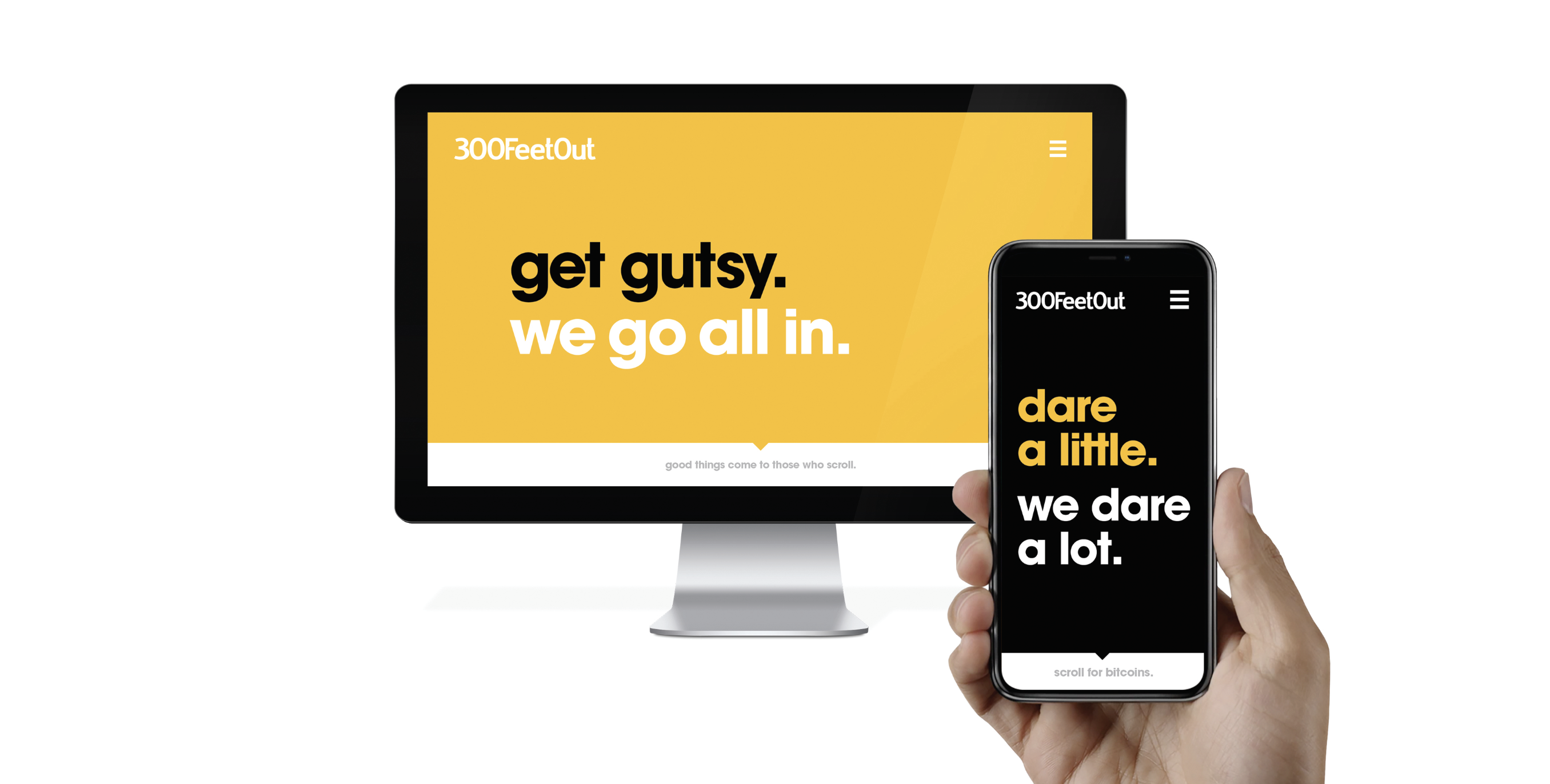
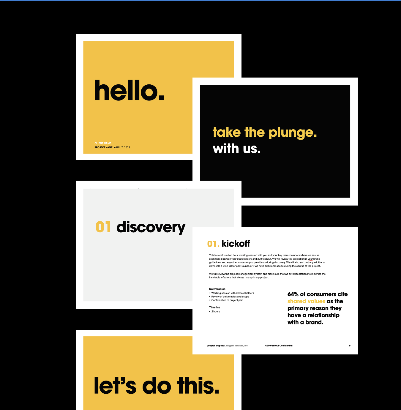
Our brand colors are friendly and bold. Our primary colors, yellow and black, are used as often as possible and are supported by the minimal use of grey. Yellow is used most often in large background color fills while black is for copy and large headlines. Yellow is also used in headlines to add emphasis.
primary colors
secondary colors
color usage ratio
color in use
typography
Our brand fonts are simple, bold, and supportive of our values. Our primary font, Avant Garde Gothic, is approachable with it's round geometric letterforms and resolute with its bold weight. It's used for all headlines. Aktiv Grotesk is our supportive font with good legibility used for body copy only.
primary font
Aa display headline.
Aa secondary headline.
secondary font
Aa paragraph text, gravida mi nibh, a auctor enim tempor non. Sed non ultrices neque. Nunc lectus lorem, condimentum vitae sem sit amet, lobortis ullamcorper nisi. Nam odio lorem, varius vel lacus id, ullamcorper suscipit arcu. Praesent vel diam nec augue porttitor molestie. Nam sed justo ac est sodales hendrerit quis nec eros. Mauris non massa vitae nunc tincidunt egestas. Vivamus enim nulla, pellentesque id pharetra sed, lacinia at nulla. Maecenas nec suscipit libero. Nunc tempor nulla eu urna tempor, ut pharetra nulla pretium.
photography
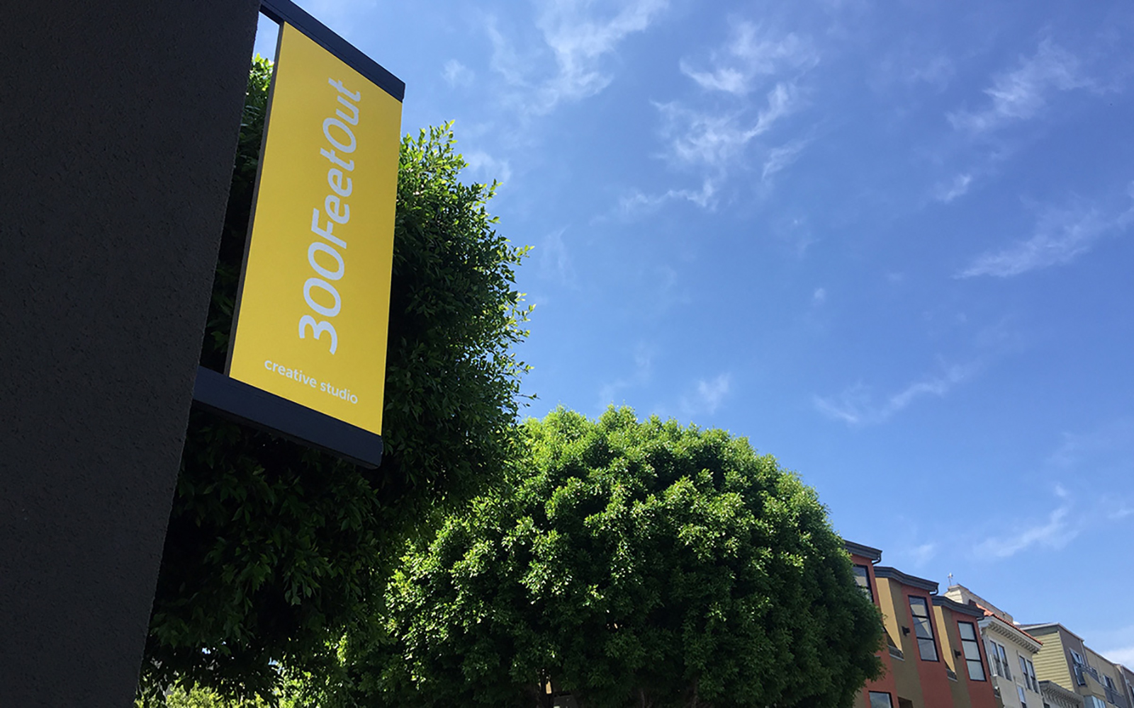
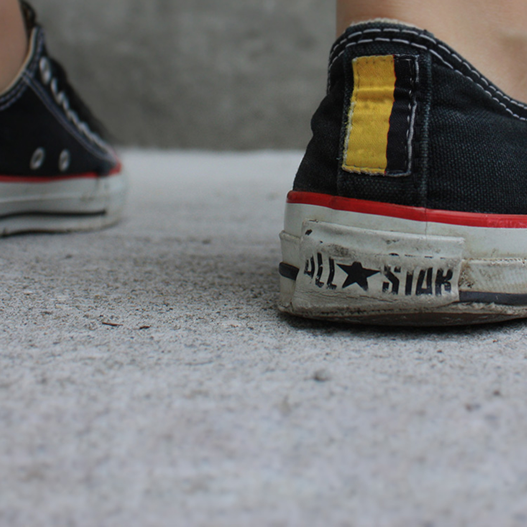
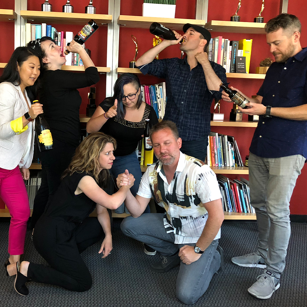
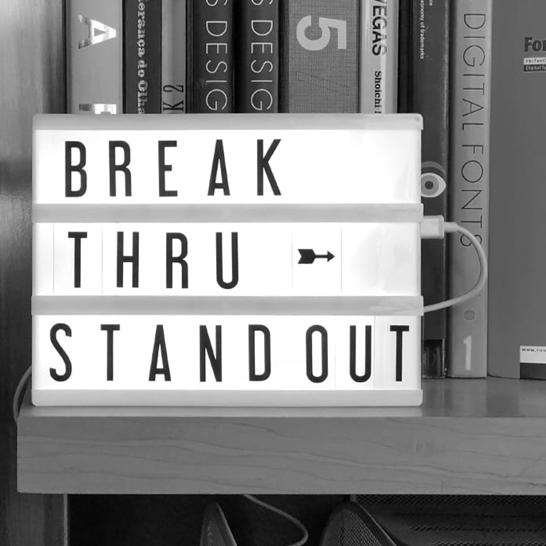
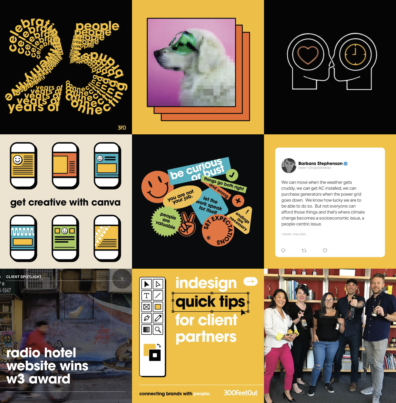
Our brand photography is fun, colorful, and authentically us. We share our culture with our customers and let our personalities shine. Photography should reflect this attitude, make an impact, have a clear focus, and always reflect our values.
photography art direction
